Finalizer
Analyzer
SPECTRO LAB In Depth
In this chapter we will dig into how the SPECTRO LAB views in the Finalizer will help you analyze your audio and assist you in making accurate and fast mastering decisions. But remember, while the SPECTRO LAB may be a very strong tool and make you see what you hear – always ears first when making decisions!
Spectral Dynamic Curves (SDC)
The SDC will create the spectrum view (level vs frequency), which includes the six Spectral Dynamic Contours which together describe the full track, as described in the SDC section. On the other hand, the RTS will show the peak and RMS levels in real-time.
The spectral dynamic contours (SDC) show the spectral and dynamic content of the audio file and provide a number of relevant things to the mastering process.
There are no firm rules or limits as such to require what the SDC of a well-mastered music track should look like. Certain music genre may have more dynamics than other genres. And similarly with regards to the spectrum.
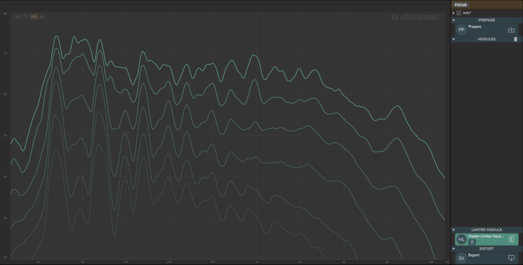
An example of an unmastered audio track is shown above.
- The file is an unmastered Electro-Rock track with a “drone” dominated structure – one note/chord from start to end. The fundamental note and harmonics/sub-harmonics are clearly visible.
- As the contour curves are fairly closely spaced at the drone harmonics (40, 80, 160 Hz), we see that these frequencies in the mix have relatively little dynamics. The reason for this can be both the sound structure, the way it’s played or the compressors and limiters applied in the mix. As it is Electro-Rock the amount or maybe lack of dynamics may be just perfect for the genre.
- From about 1 kHz and up the curves are spaced fairly evenly, which tells us that there is clearly more dynamics in this part of the spectrum than at the drone harmonics.
- At about 9 kHz there is a peak mainly at the 2-3 highest dynamic contours and from listening it’s clear that the Hi-hat is the dominating instrument. This is evident, when switching the RTS on.
- At 400 Hz to 1.2 kHz there are some peaks mainly at the highest levels in the mix and they come from the lead vocal. It may be worth checking whether these peaks stick out in the mix and could need a bit of compression or dynamic EQ.
- It should of course also be checked if the low-end energy translates well to other playback systems from ear-pods/headphones to large speaker systems. The SDC indicates that a lo-cut EQ may be relevant.
After adding two processing modules the SPECTRO LAB will look like this:

- Note that we are looking at the full, processed track (B). The Difference toggle is enabled such the curves are “filled” corresponding to how the modules have affected the result, i.e. the difference between A to B.
- In this case a Bell EQ at 80Hz and a Dynamic EQ at 2.1 kHz have been inserted.
- The Spectro Dynamic Curves show that the 80 Hz Bell EQ affects all 6 curves equally. This is because an EQ affects all levels in the signal equally within its frequency band.
- For the Dynamic EQ centered at 2.1 kHz, mainly the upper curves are affected. As the Dynamic EQ is compressing the levels above the specific threshold in the specific frequency band, this will be heard and shown on the highest levels of the track.
- Note that the Attack and Release times will affect how lower levels in the track may also be affected by a dynamic module. A long Release time will make the Dynamic EQ more gradually release its gain-reduction, hence affecting other parts of the track below its threshold. Only listening can determine the appropriate Release time, but the SDC will always reveal the effect it has.
When the Overlay is activated and the EQ module is selected, we see the EQ overlay curve has an area identical to the Difference areas on the SDC curves. Although the SDC knows nothing of the particular EQ, it has analyzed its effect on the track. Note the EQ controls are also available in the SPECTRO LAB view:

Selecting the Dynamic EQ will display its overlay curve. The max gain-reduction curve, as well as its controls that are available in the SPECTRO LAB view:

In this spectrum domain, the processing modules can be selected and their effect on the levels at different frequencies can be seen easily.
Average Spectrum Curve (AVG)
Further analysis on the example from above can be done with the Average Spectrum Curve (AVG) in the SPECTRO LAB. We can see A (prepared track, blue) and B (processed track, green) and how they differ due to the EQ and Dynamic EQ inserted above.
In the AVG view all traces are loudness normalized so we only compare spectrum, not potential loudness difference also. This is why A and B are different beside the EQ and Dynamic EQ changes.
In this example, 7 tracks supposed to end up on the same album have been imported as reference tracks in Finalizer and they all show up (magenta) on the AVG view. One of the reference tracks is selected and it is highlighted.
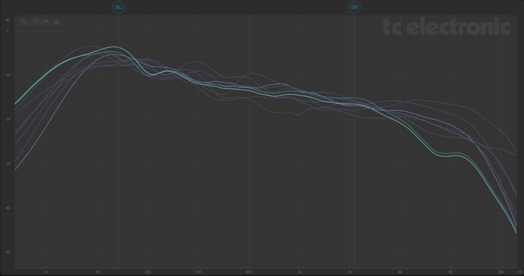
So what can we see in the AVG view?
- First of all there is clearly a shared spectral tendency on the 8 tracks but there are also differences.
- For example from about 6 kHz and up on the song we are working on (green).
- It is also the track with the most bass energy at 80Hz
- And it has the softest roll-off when looking at the low end around 20 Hz.
- So the track is a good deal darker than the rest, but that is also how it’s composed, mixed – and sounds by the way, not to forget! So it may very well be perfect, but it’s worth digging further into when making mastering decisions.
- All the other tracks can be examined the same way. For example investigating why they are different and making sure that this is actually intended. Observations on the reference tracks:
- Some have a good deal more energy at high frequencies
- Some have peaks at 250 and 500 Hz
- One of them has a dip from 500 Hz to 1 kHz
- Are any of these observations hindering a great experience when listening to the full album?
- Are all the tracks presenting themselves as good as possible?
- And are they taking the roles they are supposed to on the combined album?
- Further that they all will translate well on multiple playback systems.
- And that they perform well against relevant other reference tracks from the same music genre.
Resolution
The frequency resolution on all SPECTRO LAB views (SDC, RTS, and AVG) is based on a constant-Q analysis. This makes it easier to see details in the whole frequency spectrum as compared to many other real time analyzers which have too little information in the bass range and too much information in the treble range (‘grass’). A constant-Q representation is also much closer to the “frequency analysis” known from psychoacoustics to be performed by the cochlea in the inner ear.
Note that all of the spectral views take the track length into account, so a double-length track, for example, is not shown with an approximately 3 dB higher level.
SDC display using a Sinewave Source
The examples below show the SPECTRO LAB views for some simple input signals such as a constant sine wave or pure tone. Further examples are shown using pink noise and brown noise sources, clearly showing the spectral dynamic contour (SDC) curves.
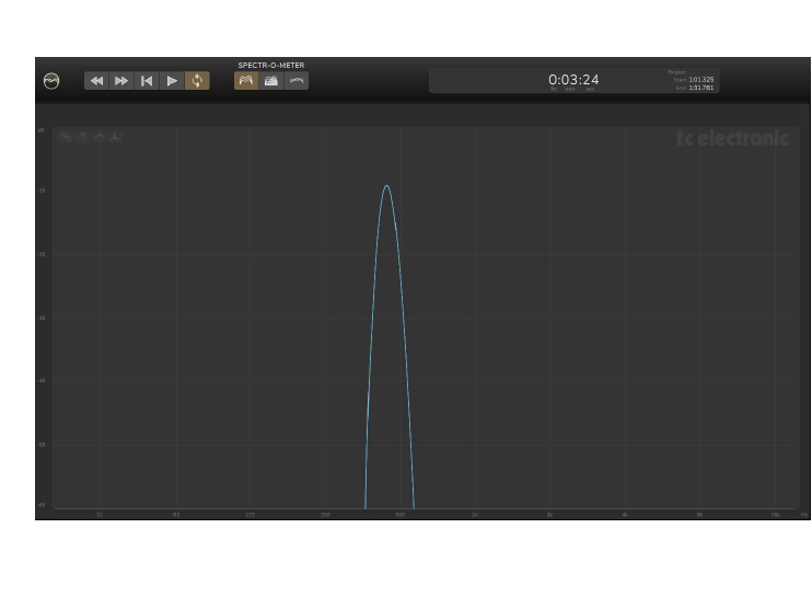
Because the pure tone, in this example, is constant throughout the track, all the level contours of the SDC collapse into the same curve. The shape of the tone in the SDC corresponds to the 1/6th octave frequency resolution employed by the SDC analysis.
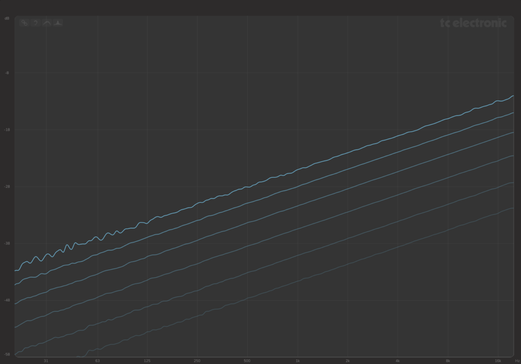
SDC and RTS display using a Pink Noise Source

The spectrum of a pink noise signal is essentially flat, in a Constant-Q analysis. That is caused by the pink noise or 1/f noise having a power spectral density (energy per frequency interval) that is inversely proportional to the frequency of the signal.
Due to the stochastic nature of the noise, it will have signal at many different levels, hence the spread of the SDC curves. The curves appear ‘noise’ in the low end, due to the ‘imperfect’ statistics of the relatively short test signal.
SDC display using a White Noise Source
In contrast to the pink noise, a white noise has more high-frequency energy. Even though this type of random signal is very common, its spectrum is actually less similar to the spectrum of music than pink noise. The SDC clearly shows the different spectrum of the noises.
SDC display using a Brown Noise Source

Brown noise, on the other hand, has more low-frequency energy than pink noise. Compared to most music Brownian noise sounds dull, as illustrated by the low-level highs.
Algorithm
For the curious or technically minded among you, the SDC curves are calculated in this way:
a. The track is split up into a number of frequency bands, each 1/6th of an octave wide
b. The signal levels of each band are measured, throughout the full track
c. The signal levels for each band are then divided up into the time-percentage ranges and the level below which the signal is, for example 50% of the time, is found (4th curve from the top)
d. The calculations are repeated for the other five percentages
e. The results are displayed as the six Spectral Dynamic Contour curves

For example, curve 4 shows what level the signal is below for 50% of the time, for each frequency.
Specifically, the six SDC curves show the level percentiles at each frequency as follows:
1. 100% (maximum level)
2. 98%
3. 83%
4. 50% (median)
5. 21%
6. 8% (softest level)
The percentage values have been carefully and intelligently chosen to show equal and usefully-spaced contour curves in the SDC, suitable for many genres of music. Signals below the 8% percentile bottom curve are usually not relevant for typical music mastering applications. The top curve at 100% should be regarded as the highest level reached during the full track, in each frequency band.